I see this kinda advice passed around all the time here is the thing: shading with black will indeed look bad if you don’t know what you are doing. However, telling people not to do things without explaining why is terrible advice.
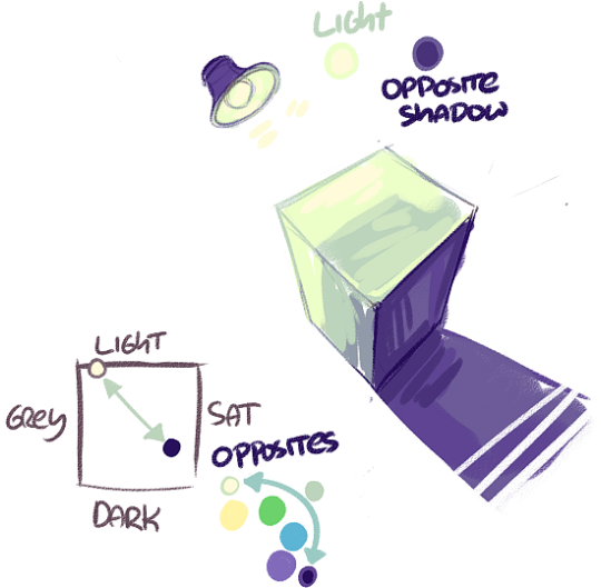
Shadows are the opposite of light, this includes in colour.
This means that if you have light in one colour, the shadow will be of the opposing hue, saturation, and value.
Unless the object is white, it has its own local colour –
the object’s true colour, how it would appear if the light were pure white.
The colour of the light influences the local colour of the object. so if you had yourself a brown cube and a blue light, the colours would get bluer and pinker.
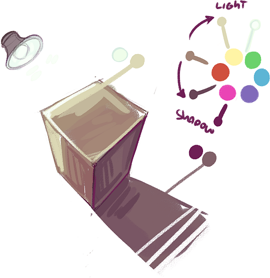
now the reason shadows do not tend to be black is because pure white light is hard to find in nature.
the closest you will get to pure white light is during a really overcast day and the sun is filtering through the clouds, but even then
it’ll lean towards yellow so the shadows will be slightly blue.
During a clear day, the shadows will pick up a lot of bounce light from the
But! None of this means you are never allowed to use black.
realistically shadows will have a hint of a colour to them, but stylistically you might be going for, say, a film noir look and deep black shadows are needed for impact for example.
The more you know about how light works, the more informed decisions you can make about shading and the more options you have.
If someone tells you that you can’t do something, they’re wrong! you can do what you like!
yes, black is hard to use and if you just mix a colour with black it’ll get muddy, but thats easily resolved by choosing your colours manually – which ideally you want to do regardless bc the computer doesnt have your eyes & cant choose the colours you like
basically if someone gives you some art advice and says you can’t do something, they’re wrong! you can, you just might need to study
a little to figure out how to make things work.
I mean for example, people will say you must make your composition follow the rule of thirds
and never align centrally, but while the rule of thirds makes it easy to create visual interest, Mad Max Fury Road is a testament to the fact
that central composition can and will work if you experiment.
there are no rules in art! there are theories based on reality, this has been a post on colour theory & light theory, but they exist to inform you, not to restrict you.
Do what you like! Trust your eyes, if you think something looks good, then great! If you don’t, then research & experiment until you do.
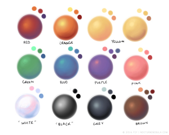
hey yall its me the Art Mom™ to help you shade pretty
rule 1: DO NOT SHADE WITH BLACK. EVER. IT NEVER LOOKS GOOD.
red– shade with a slightly darker shade of purple
orange– slightly darker and more saturated shade of red
yellow– i think like..a peach could work but make it a really light peach
green– shade with darker and less saturated shade of blue or teal
blue– shade with purple
purple– a shade thats darker than the purple you’re using and maybe a little pink (MAYBE blue)
pink– darker shade of red
white– a really light lavender or blue..or i guess any really light colour??
black– okay listen dont use pure black to colour anything unless you want to leave it with flat colours because you cant really shade black lol
grey– a slightly darker shade of purple or blue (less saturated)
brown– slightly darker and less saturated shade of purple or red
aaaaand thats all i got lol. let me know if there is anything i should add to this list!!
If you’re a visual learner…
I made some Balls of Colour to go with Art Mom™’s post:
…..dont listen to this, shade and color however you want. and instead of thinking of what color the object has, consider the color of the light that shines on it, or the lack thereof. you totally can shade black, and use black to shade, idk why you would think otherwise. anyway psa there is no right or wrong in art do what you want, if it feels good and looks like you want then go for it
Even if i dont reblog every “tag yourself” meme you better believe im still reading every description and deciding which one i would tag myself as anyway